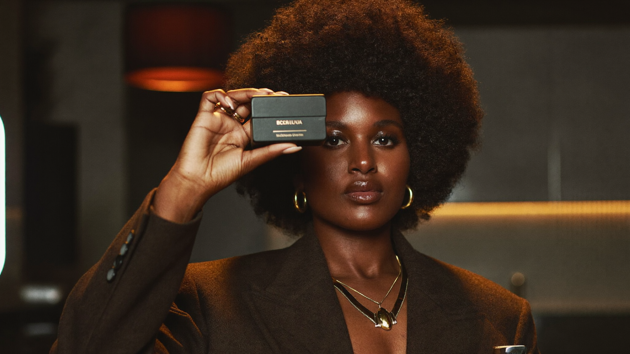
Beauty · Web + UGC · Dar es Salaam
Queen Beauty Corner
A salon with no web presence, now a WhatsApp-native booking site + content system. Live in days — the owner cried when she saw it.
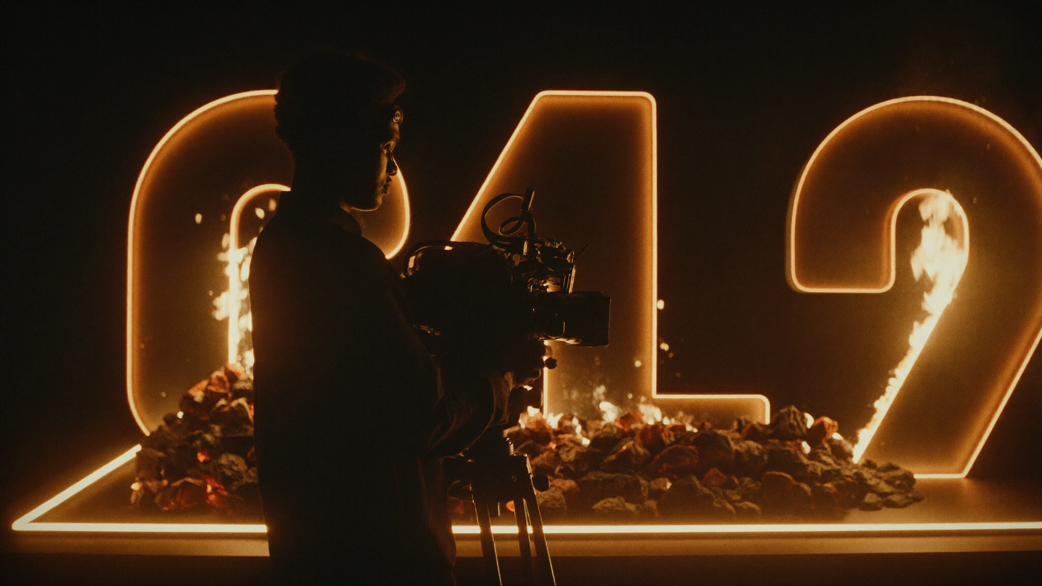
We build the new-age media brands actually need — creator ads, viral short-form and content systems engineered to turn attention into revenue. Not just websites. Conversion tools.
Trusted on work for Mars · VICE · CBS Sports · NCAA · Diageo · Sauti Sol · +18 more
Every piece we make has a job: stop the scroll, earn the trust, move the number. Here's the toolkit.
Creator-shot ads that feel like a friend's recommendation and convert like paid.
Short-form built to travel — hooks, pacing and payoffs tuned for the algorithm.
Always-on content systems so you never run dry — filmed, edited, shipped, optimised.
We put spend behind the winners and scale ROAS — not just reach.
Sites and funnels that turn attention into booked calls and sales.
The plan behind the pixels: positioning, offers and the metrics that matter.
From Nairobi stages to US broadcast to a salon in Dar — media that earned attention and moved numbers.
A salon with no web presence, now a WhatsApp-native booking site + content system. Live in days — the owner cried when she saw it.
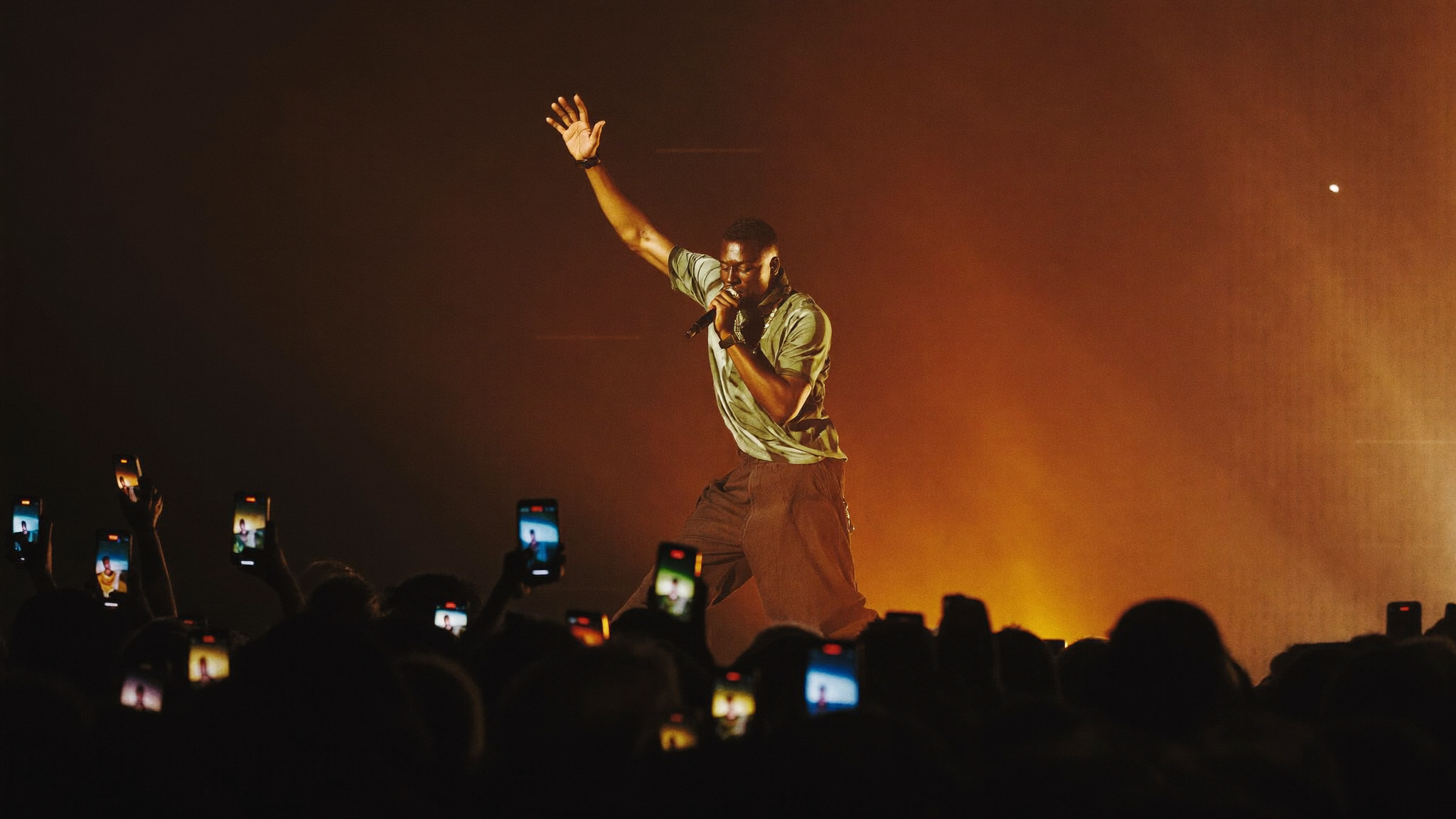
Release films for Sauti Sol, Nyashinski, Fuse ODG & more.
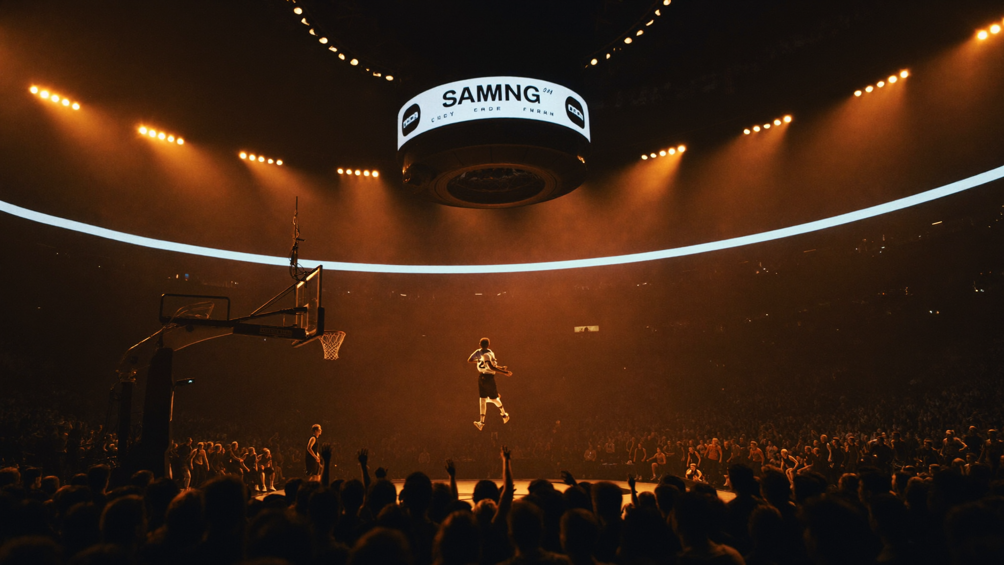
Broadcast-grade social for CBS Sports & NCAA basketball.
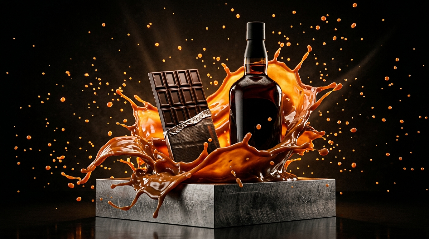
Campaign work for Mars, Diageo, Airtel & SportPesa.
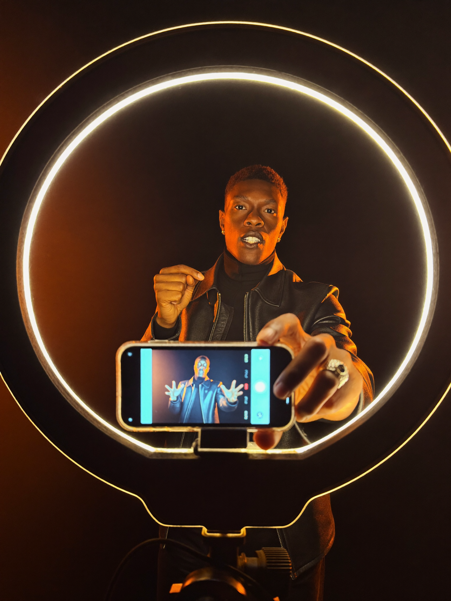
Creator ads that beat studio spots on cost-per-result.
“I saw my business the way my clients will — I actually teared up. This isn't a website, it's a machine that books clients.”
The edge we sell is the edge we're building. A look at what's cooking.
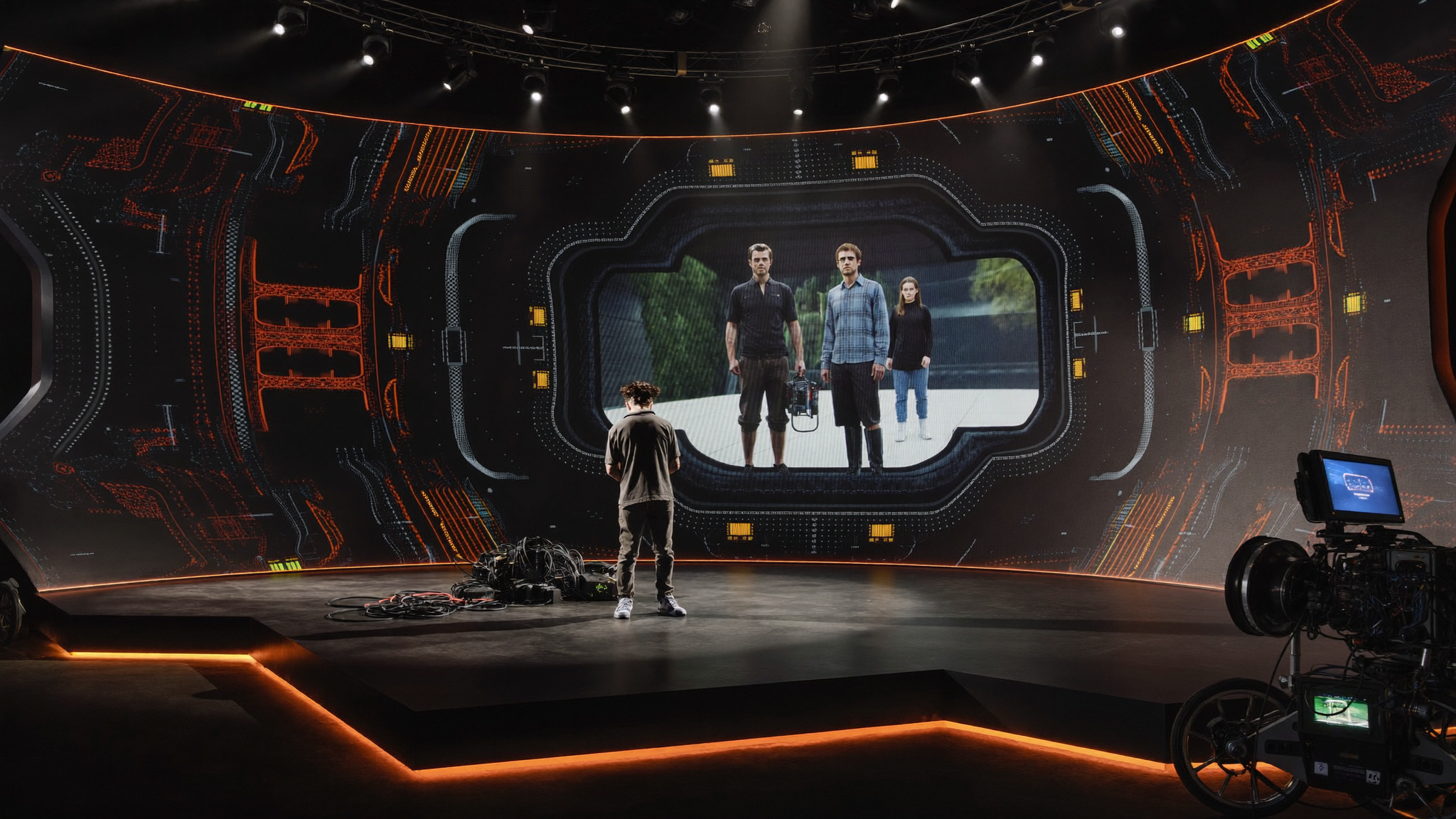
Direct photoreal 3D scenes with plain-English voice commands — AI-native virtual production, no render farm required.

Feed it a product, get back scroll-ready ad concepts, scripts and edit plans — the content engine on autopilot.

Tell us what you're launching. We'll tell you the media that'll move it.